Creating a glowing neon icon style in Illustrator. With this effect, which is easy to create, your icons can stand out from the crowd.
In this tutorial, we are going to use icons that I have created as a package (minimal icons style) several years ago. There is a free version of it (100icons), and there is a paid one (400icons), which you can download accordingly. Besides the number of icons in the free version, there is a slight difference in the style of the icons as well, which with a little manual work you can make took like the paid package.
You may also be interested in “20 Free Minimal Vectors Social Media Icon Pack Ink Style“
Neon icon style in Illustrator:
Creating a neon icon style in Adobe Illustrator is really a matter of a couple of seconds, and yet we are getting a very interesting icon effect at the end.
The icon that we will turn into a glowing neon icon style is the following:
Steps 1(expand):
If you haven’t already expanded your icon graphic in Illustrator, select your icon and go to Object – Expand. Make sure you have checked fill and stroke and click ok.
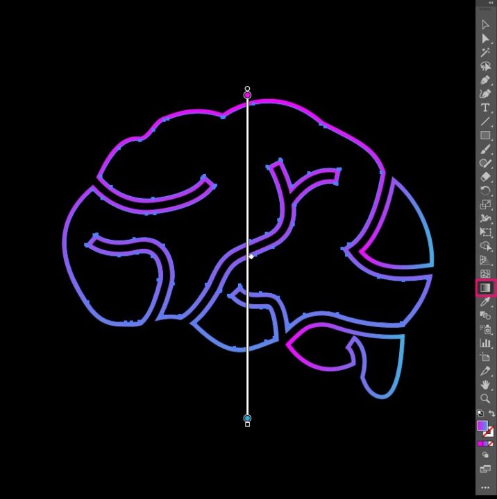
Steps 2 (apply gradient):
Having still selected your icon, make sure you have selected your fill color and not the stroke color in your tool palette and go to Windows – Gradient.
- Click on the gradient icon box in the upper left corner of the gradient window, to apply the default gradient colors on your icon.
- Then, select the left color from the gradient rectangle box and chose a color for it.
- Chose another color for the right gradient rectangle box.
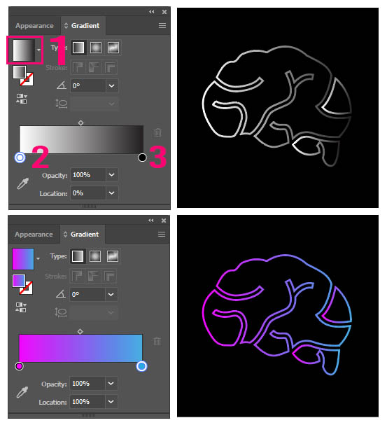
Note: You can adjust the position of your gradient colors, by grabbing the gradient tool from your toolbox and designing a new position (dragging on the screen with your mouse.)
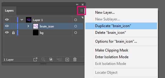
Steps 3 (duplicate icon layer):
Go to your layer panel (Windows – Layers) and duplicate your icon layer once, by going to the three horizontal lines in the right corner of the layer window and selecting the duplicate option. Now we have our icon in two layers.
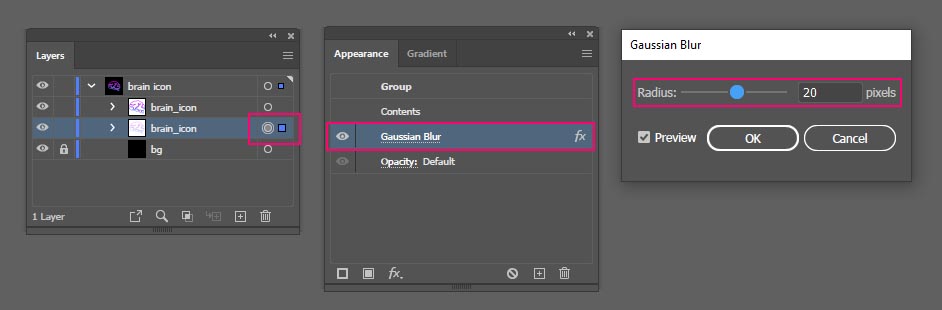
Steps 4 (apply Gaussian Blur):
Select the second icon layer (below) and go to Effect – Blur – Gaussian Blur.
Play with the gaussian blur slider to choose the right amount of blur you want for your icon.
Note: You can change at any moment the amount of blur you applied, by selecting your gaussian blur layer and going to Window – Appearance. After clicking on the Gaussian blur attribute, the same window as previously appears, so you can make changes to the amount of your blur.
Extra Steps:
For now, our final neon icon style is the following:
If you prefer it more intense you can duplicate the second layer a couple of times, until you are happy with the result. You can see a couple of duplications of that layer and the final result in each of them:
And of course, if you want more spread of the neon style into your icon, you can revisit Steps 4 (apply Gaussian Blur) for further adjustments.

One Response