We are going to create a simple 2D reveal logo animation with After Effects. The process is pretty simple and not time consumed at all. No need to be an expert to create it, and no plug-ins are needed.
You can make use of your final 2D reveal logo animation with After Effects in many ways. Such as YouTube, Social Media, Websites, and really anything these days that support video format.
Table of Contents
ToggleMethod:
We are going to use the same technique with masking in After Effects we used in an early post “MAKE A COOL REVEAL INTRO LOGO WITH SABER PLUGIN IN AFTER EFFECTS”. But instead of using the Saber plugin, which is so cool and very powerful by the way, we are going to use the simple “stroke” effect inside After Effects. It’s more like a simple and elegant approach to reveal logo animation stuff.
So, combining masking technique and using the stroke effect, we will achieve to create our 2D reveal logo animation with After Effects.
We will also need one other thing. Our logo in Adobe Illustrator format.
Logo format:
Why in Illustrator format! It’s pretty simple. All Adobe products have great compatibility with each other. One copy-paste can travel through Adobe apps. And to be honest is just what we need for this concept.
Note: If you don’t have Adobe Illustrator in your system, you could still create the 2D reveal logo animation, but the process will be longer. The reason is you will have to re-create your logo in After Effects. Fortunately, using Adobe Illustrator in our pipeline that’s not the case.
Concept:
If you are a blogger and you use WordPress as your platform when you press the preview button to generate a preview of your working post, WordPress shows a 2D reveal logo animation on a white background as you wait, their logo. Forget a loading bar, or percents, or anything else boring. It’s a quite clever way to keep you waiting. I think it’s pretty cool.
We are going to re-create the WordPress 2d logo animation style. By doing so, you will be more than capable to transfer the knowledge you gain to create your own reveal logo animation.
You can watch all the steps in the following video.
Note: For more details on the specific subject keep reading.
2D reveal logo animation:

We will be working on the WordPress logo. Download the file from here.
I am going to cover the approach of using Adobe Illustrator to transfer our logo as a mask inside After Effects. As I said if you don’t have Adobe Illustrator you have to create your logo inside After Effects, which could take some time, dependent on your logo’s complexity.
Reveal logo:
Step 1:
So, we open up Adobe Illustrator with our logo. Make a selection to include the entire logo and press ctrl + c to copy it. In this way, we have copied the information of our logo and we are ready to paste them inside After Effects.
Therefore, we are jumping into After Effects.
Step 2:
Open up a new After Effects project, make real quick a new composition (1280×720), create a new solid layer, and rename it “logo“. Make it any color you like, I made mine blue, but it doesn’t really matter.
Step 3:
It’s time to paste the information on our logo. Select the solid layer and go to Edit – paste (ctrl + v). Now the logo layer has all the logo information from Adobe Illustrator as separate “masks” inside After Effects. Great, right! Just one copy–paste and all the information has transferred. You could verify this by opening the logo layer and taking a look at the separate masks over there.


Ok great.
Reveal animation:
Now it’s time to make our reveal logo animation, and as I have already said we will use the “stroke” effect inside After Effects.
Select the logo layer and go Effects & Presets panel and search for stroke. Drag it onto your logo layer. Cool. Now open up the Effect Controls panel.
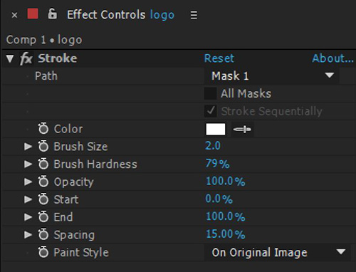
As you can see, we have many settings to play with. We are going to use many of them.
Approach No1 (simple):
Set the path to All masks, and the paint style to On Transparent. Play with the end settings for animation purposes. Go to frame 0 and set the end parament to 0 and click on the stop-watch to set a key. Go three seconds later and set the end parament to 100, in that way you automatically set your second key. Now you have your animation.
You can always play with the brush size and color.
Note: The simple approach is ok I guess, but it has not the variation that the second approach has. If you look closely at the original WordPress logo animation you will find out that not all the lines travel at the same time, there is a variation through time. The only reason I mention this approach is that is more simple than the second one.
Approach No2 (official):
This time we will have the variation we need. In order to achieve that we are not going to set the path to All masks, we will set it individually. Basically, that means that all our masks will not be controlled through one stroke effect like approach no1. Instead, they will be controlled by separate stroke effects.
In approach no1, we had only one logo layer. This time to achieve our goal we have to duplicate our logo layer as many times as the number of masks we have on it. We have 5 masks on the logo layer, so we will duplicate our logo layer five times.
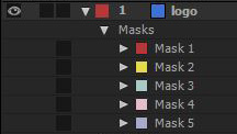
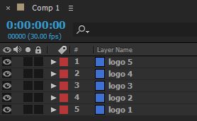
Now we had duplicated our logo layer five times, we have to set on each logo layer the proper path mask. Remember we don’t want to use the All Mask parament.
So, for the logo 1 layer, we set the path to mask 1. For the logo 2 layer, we set the path to mask 2, and so forth until 5.
Now the 5 masks have separate stroke effects, you can give some variation on the timeline by moving some keyframes.

Conclusion:
As you can see both approaches are pretty simple. Of course with the second one, you have more variation and control over your animation. I think it’s totally worth the extra time to prepare it compared with the first approach. But again it’s up to you and your project which one you will use. Every project is unique and we have to approach it differently as you already know.
What do you think guys? Which approach do you prefer? Any creation you want to share that you accomplish with this technique?



12 Responses
“Great tutorial! After Effects can seem overwhelming, but your step-by-step guide made creating a 2D reveal logo animation so approachable. Can’t wait to try this out for my own projects. Thanks for sharing!”
You are very welcome. I am glad you find it helpful. Indeed AE at a glance seems overwhelming, but if you practise a little bit, it starts to make sense. The more you practise the better you will become, as anything in life. Hope you make something creative out of this post.
Fantastic article! Your step-by-step guide on creating a simple 2D reveal logo animation with After Effects is incredibly clear and beginner-friendly. The use of After Effects makes it accessible to a wide audience, and your attention to detail ensures a polished result. Thanks for sharing this valuable skill – looking forward to trying it out and adding a professional touch to my projects!
Great site with quality based content. You’ve done a remarkable job in discussing. Check out my website Webemail24 about SEO and I look forward to seeing more of your great posts.
It is a pleasure to read this weblog, thanks to its up-to-date information and interesting posts. Look into my web page Seoranko for some really good points and find out more about Bitcoin.
Awesome page with genuinely good material for readers wanting to gain some useful insights on that topic! But if you want to learn more, check out FQ4 about Cosmetics. Keep up the great work!